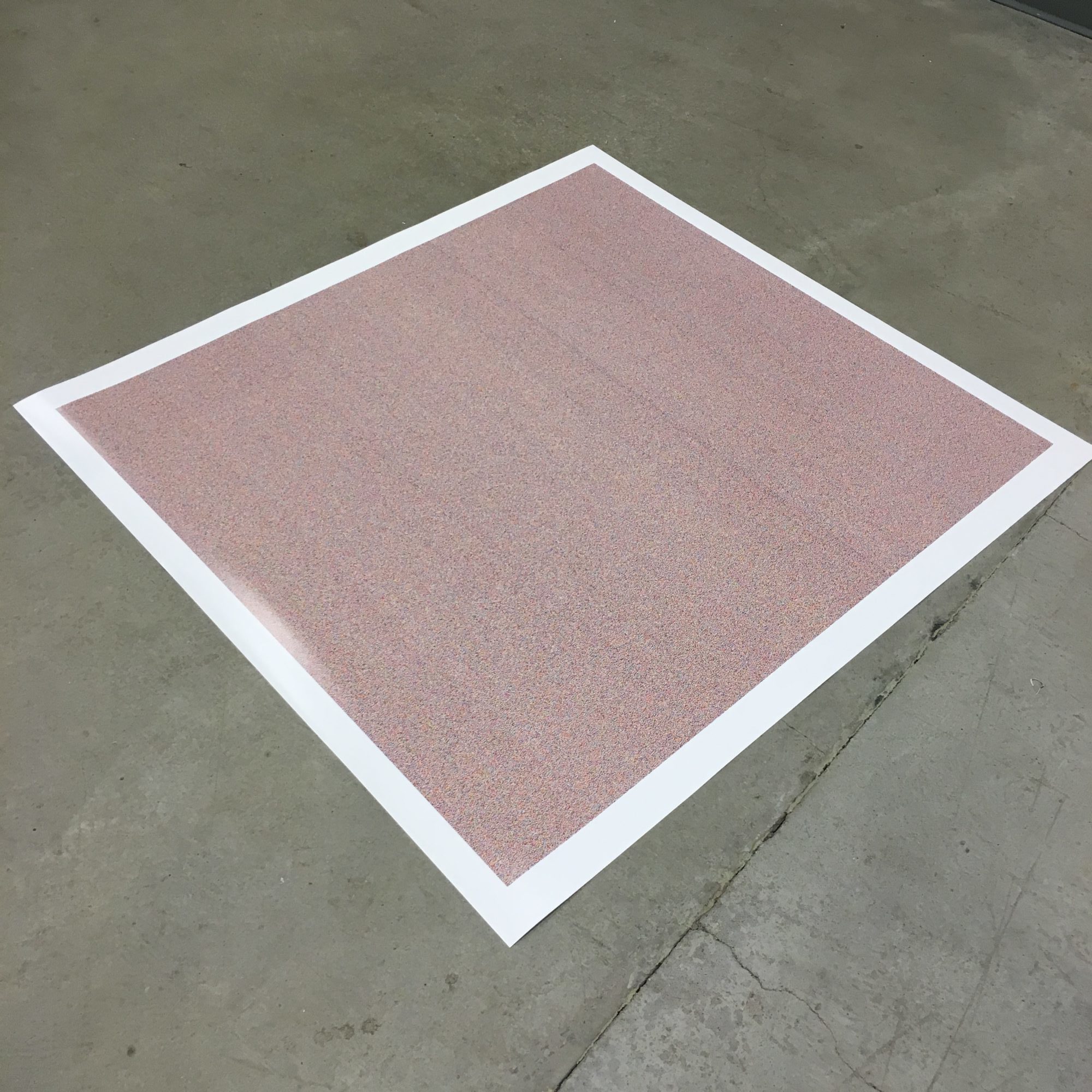
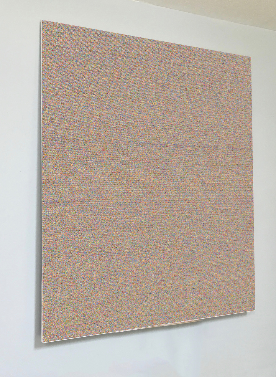
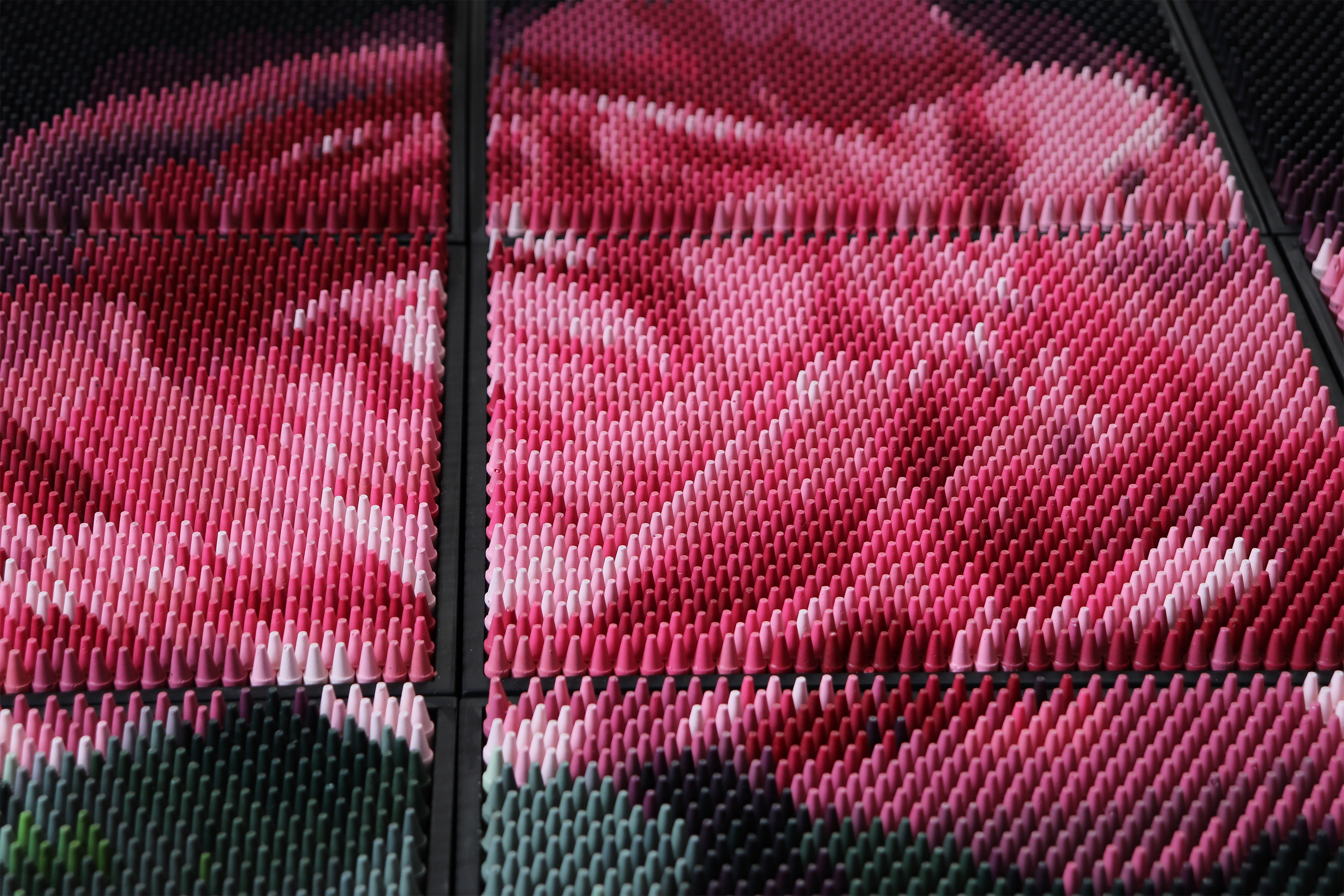
Portrait of God, 2018
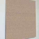
Digital File NFT & Limited edition Giclée Print, 43 x 47.5 inches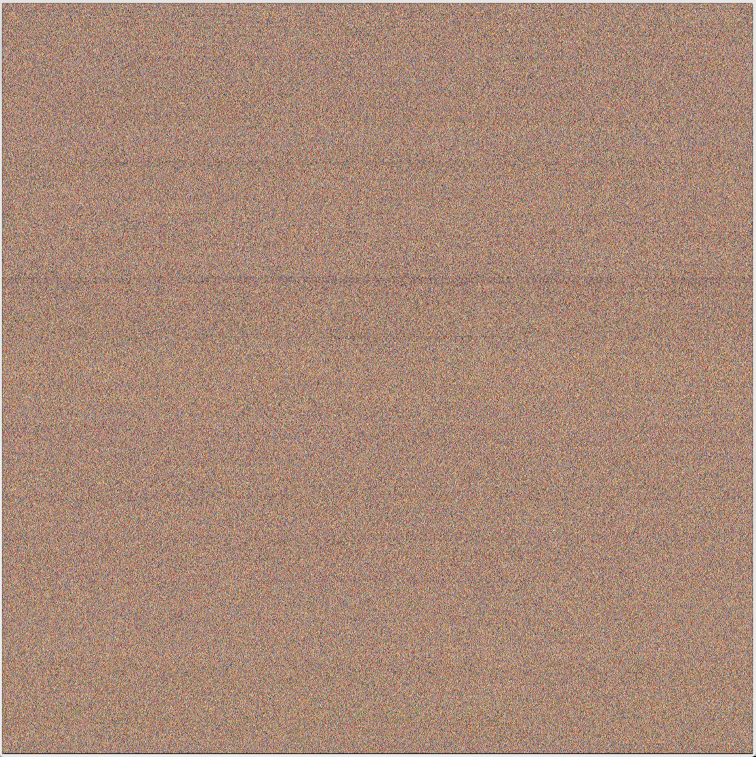
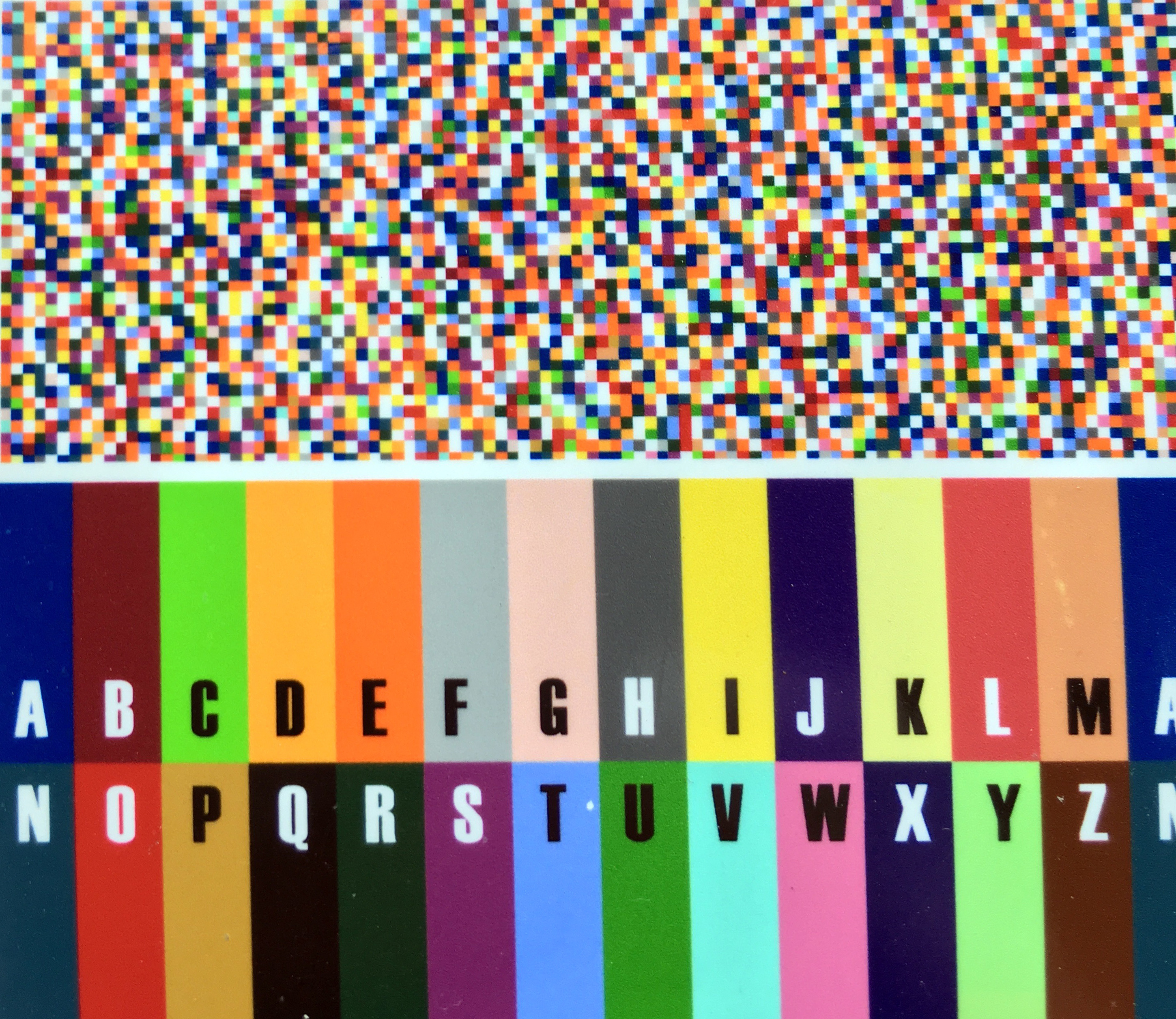
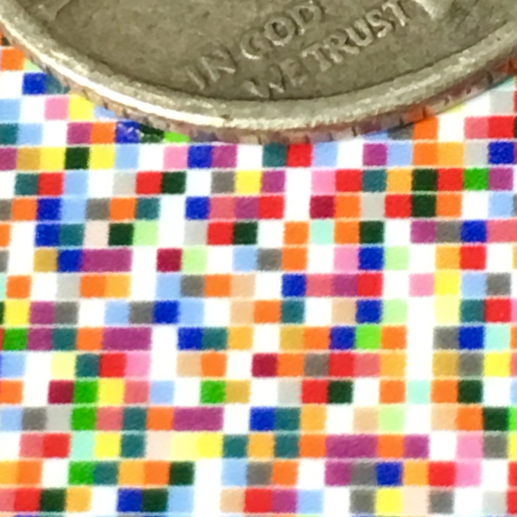
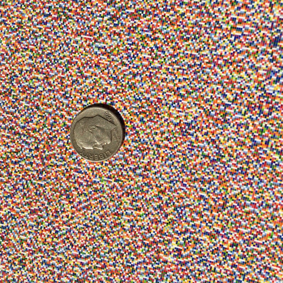
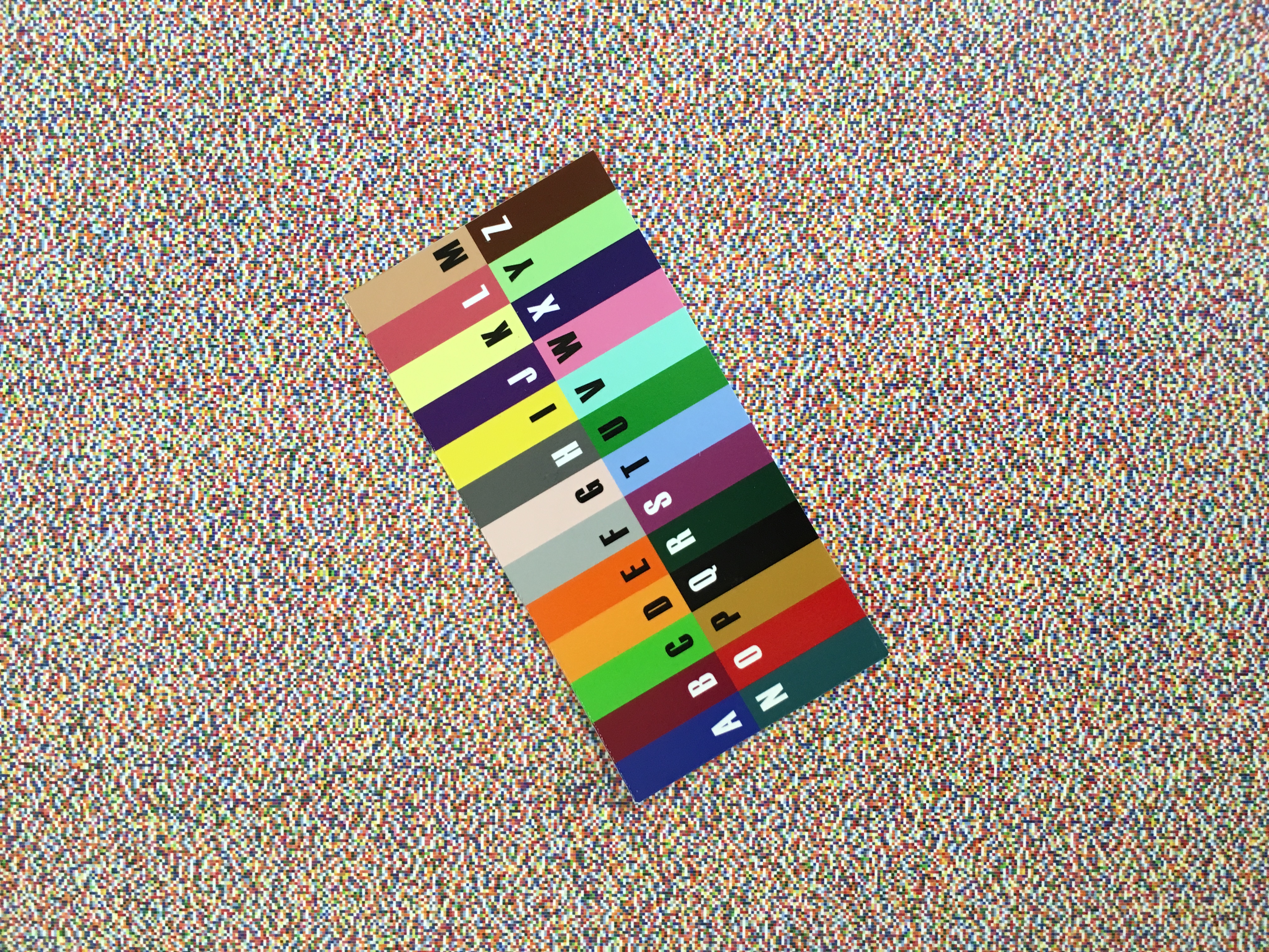
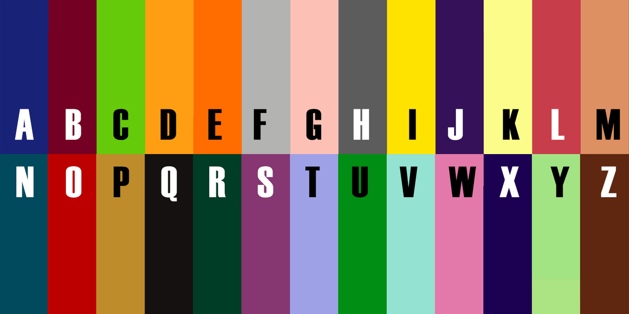
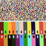
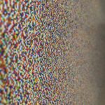
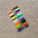
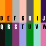
Image made up by mapping every letter/word in King James Bible (Old and New Testament) to my color alphabet (26 indexed colors + white space -see key below) and displaying each of the 4+ million letters as color pixels.
The 790,039 words contained in this image are to be “read” from left to right, top to bottom. All grammatical marks and cases have been removed to leave just the 26 color letters and white spaces between words.
Portrait of God
Portrait of God began with a system already in place before this particular piece existed, a color alphabet built to translate the twenty six letters of English into color, so that a text could be read, in principle, purely through hue and adjacency rather than through the recognition of shapes. Applying that system to a body of writing was always the intent behind building it, but the choice of which text to run through it mattered enormously. I wanted the most generic possible candidate for a text that everyone would recognize as the Bible, and the King James Version answered that description directly, both as the translation most culturally synonymous with scripture in English and, more practically, as a text freely available in digital form.
The title makes a claim the image itself cannot visually support, and I wanted that gap to be there rather than smoothed over. The premise comes from the opening of the Gospel of John, where the word and God are identified with one another, so that scripture is not merely a record of the divine but is proposed to be continuous with it. Taken literally, that identification licenses an odd substitution: if the word is God, then a complete visual rendering of that word, every letter, all four million of them, arranged in order, becomes a portrait of God in the most direct sense available to an image maker. I was less interested in defending that theological claim than in seeing what happened when I built the image as though it were true.
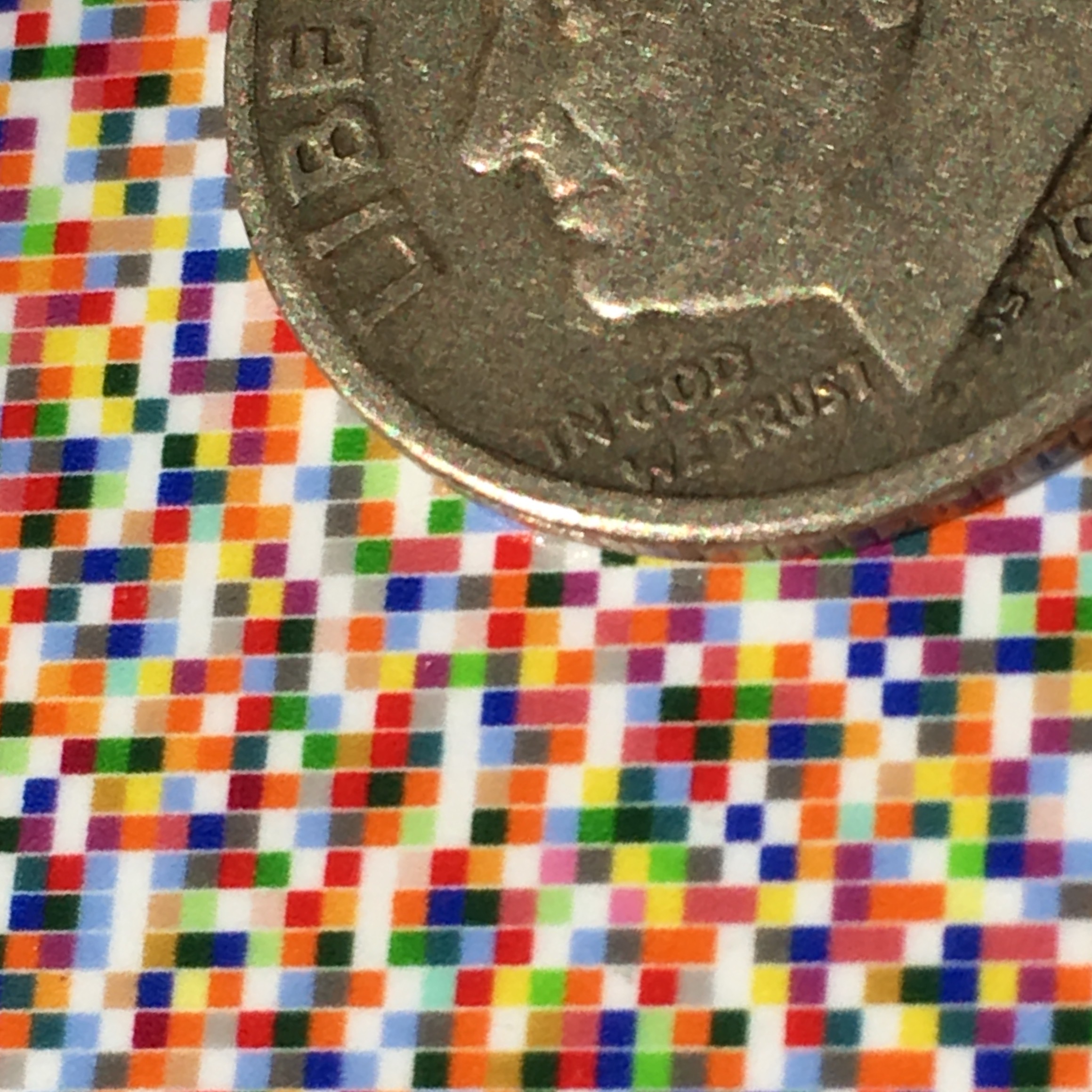
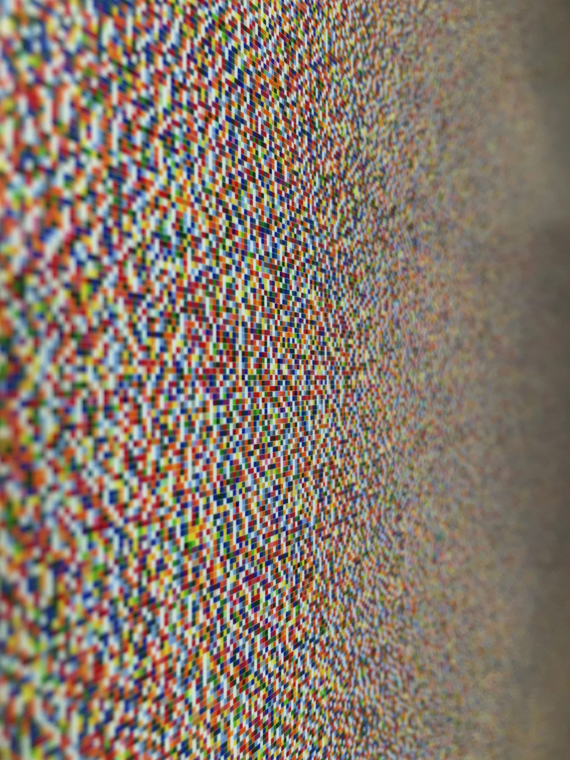
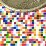
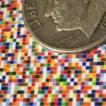
What happens is a picture no one can actually read. The full text, converted letter by letter into colored glyphs and arranged left to right, top to bottom exactly as the Bible reads, produces an image legible only in principle. Standing in front of it, a viewer sees color and pattern, not sentences. I included a small magnifying loop with the piece specifically so that someone could confirm the illegibility is not arbitrary, that individual words and passages are genuinely encoded there and recoverable at the right scale, even if no one will ever sit down and read four million letters in sequence. That tension between claimed legibility and actual illegibility matters to me as much as the color itself. I want the authenticity of the underlying material, the fact that this is actually the Bible and not a simulation of it, to be part of what the piece is asking a viewer to take seriously.
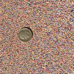
I did not anticipate what the image would look like once the entire text was processed, and one result surprised me more than any other. At the density required to render four million letters, faint stripes and bands of light and dark become visible across the image, an effect that comes directly from shifts in vocabulary, sentence length, and letter frequency between different books and, presumably, different authors and scribes across the centuries the text was assembled. The Bible’s plural and historical authorship becomes visible, statistically, as texture. That finding sits uneasily against a title asserting a single divine source for the text. I do not know which reading a viewer will settle into, evidence of human multiplicity or a title’s insistence on singular authorship, and I am not sure the piece needs to resolve that tension in either direction. Approaching the work through a systematic and almost data driven process, I was less interested in confirming a conclusion in advance than in seeing what the system itself would reveal once set in motion.
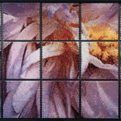
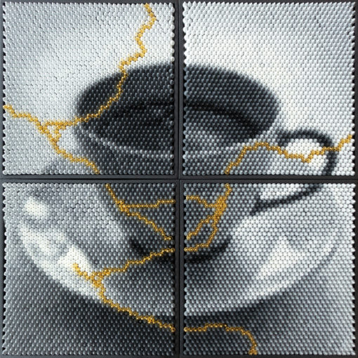
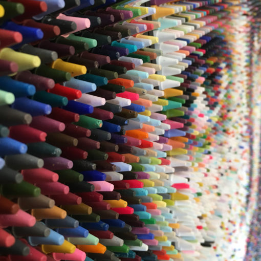
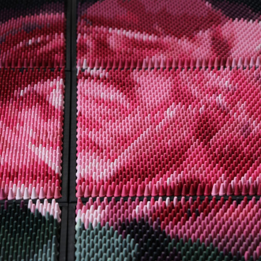
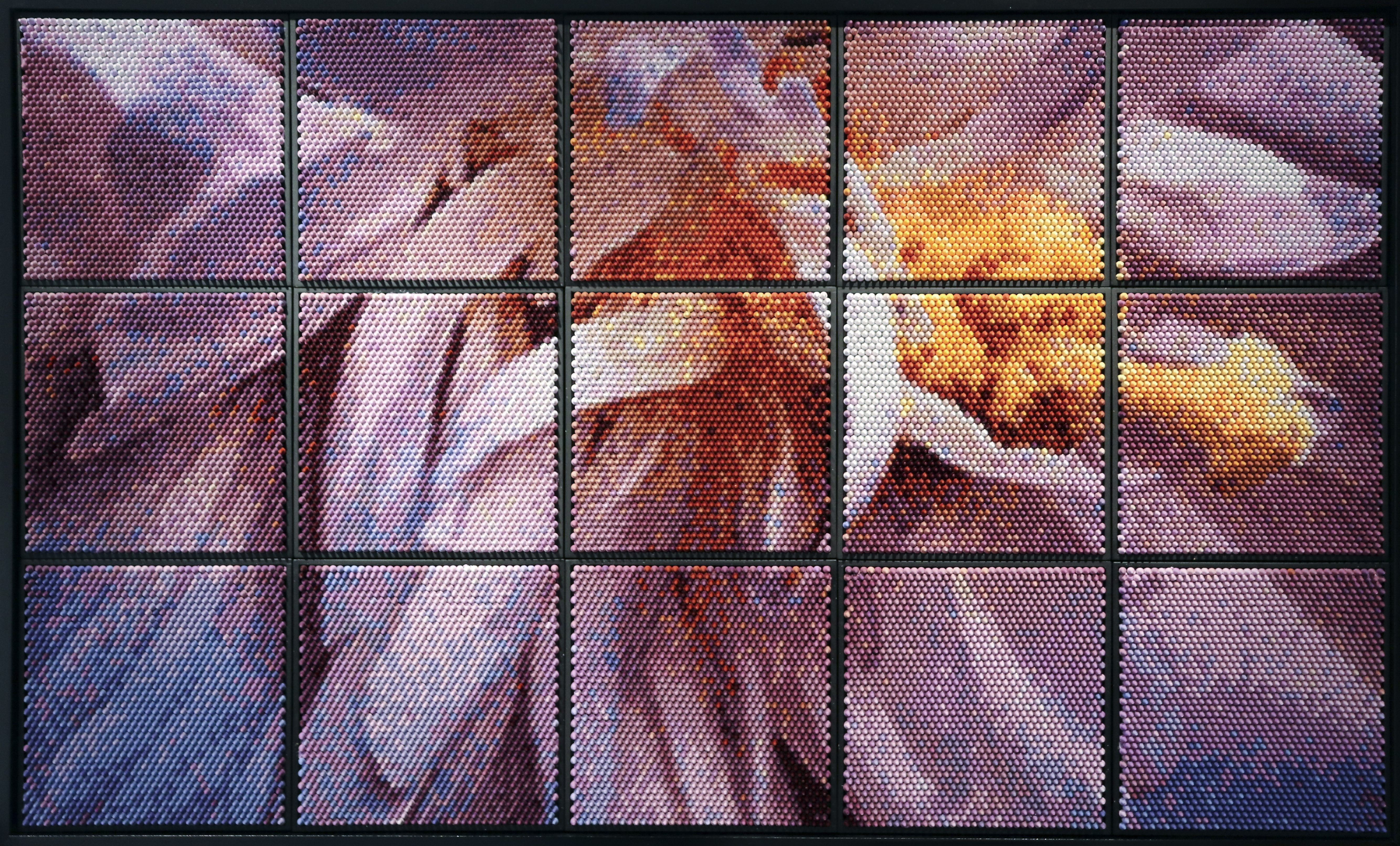
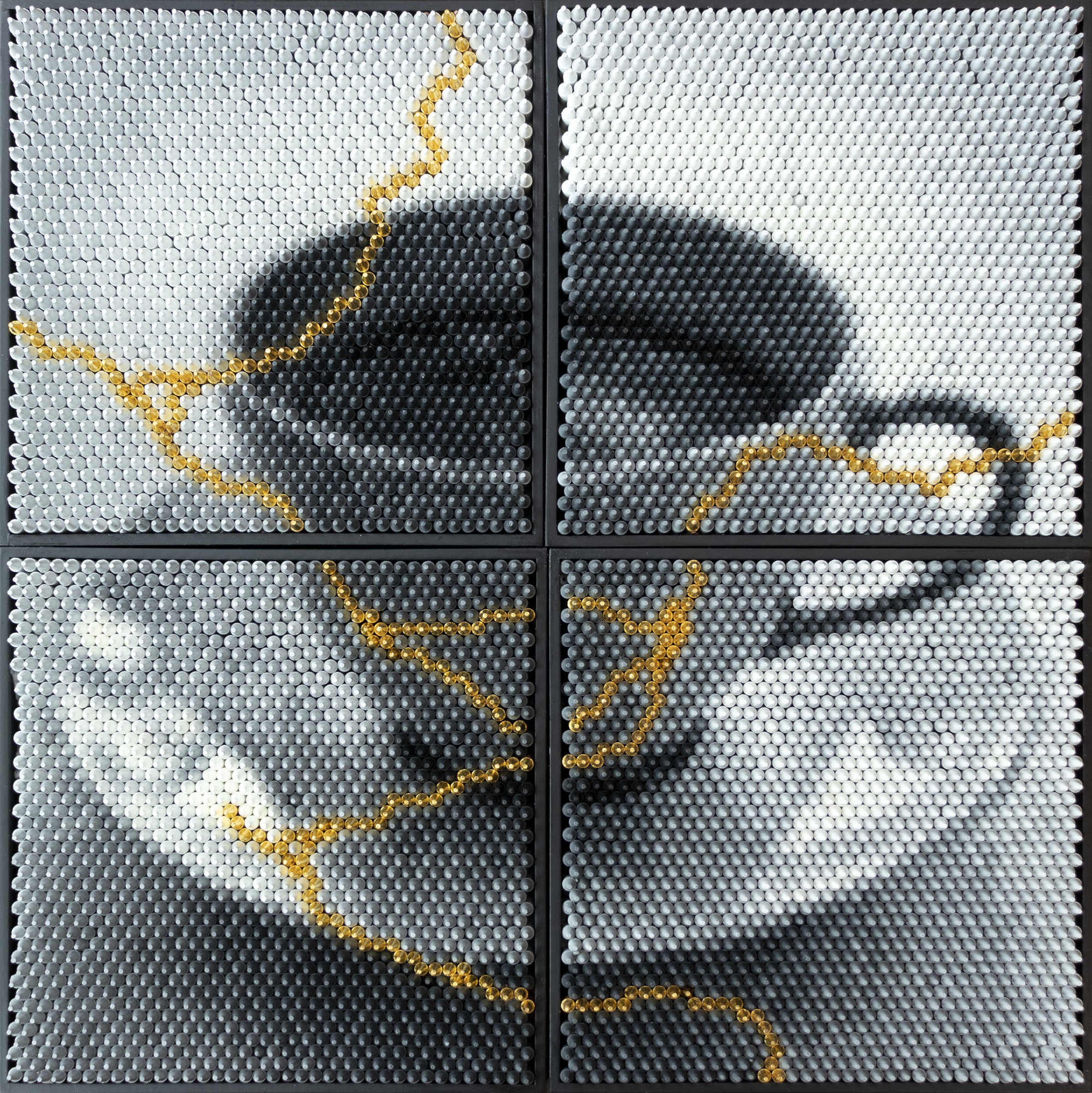
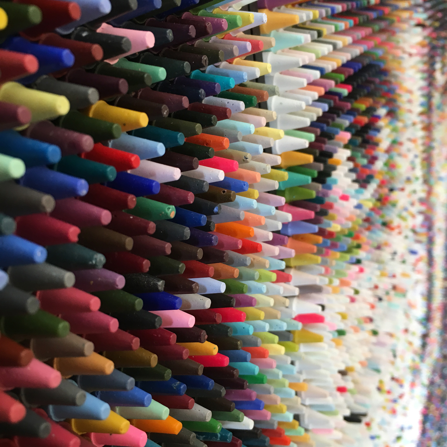
Scale remains unfinished business for this piece. Four editions exist as a giclée print at forty three by forty seven and a half inches, alongside a digital file released as an NFT, but I think of the print as the stronger encounter of the two, in the same way my crayon panels ask a viewer to move physically between two registers of looking, close enough to see individual letters and colors, then far enough back to take in the whole field at once. That oscillation is central to how the piece is meant to work, and a larger print, ideally wall sized, would only sharpen it. The digital file carries the same data, but the print’s physical presence, its actual size relative to a standing body, does something the screen cannot quite replicate.