How the 26 colors were chosen

People can distinguish the difference in hue, saturation and value (brightness) of in excess of a million color combinations (Halsey and Chapanis, 1951; Kaiser and Boynton, 1989) when colors are compared side by side in optimal lighting conditions. This being said, color memory in people is not very good, nor is the ability to discriminate among specific colors that are even remotely similar when separated by time. In this situation the number of colors that can be readily identified drops to 12.
This might be due to a number of factors, such as the increase in light needed to accurately see colors, the fact that, because of our biological make up, color tends to change in an object because of the interplay with other colors in the vicinity of the color being observed or the color of the light used to view the object in question, and perhaps, it is because we do not use color in a consistent way where accuracy needed in our daily lives. We tend to use qualifiers (darker, lighter, -ish, etc.) to describe the differences in colors instead of giving colors individual names. (see Munsell Color System.)
Work done in the late 60s’ on Color Evolution theory shows that there are regularities in naming colors across many different languages as well as the order in which these terms are brought into the culture over time, with black and white being the first colors to appear in a language (if that language has any specific words for colors), followed by red, then green and/or yellow, blue and finally the colors purple, pink, orange, and brown. All other colors are considered by most speakers of that language to be variants of these basic color terms. All languages today that have color terms are considered to have between 2-12 terms with English coming in at eleven color terms (Basic Color Terms: Their Universality and Evolution Brent Berlin and Paul Kay, 1969).
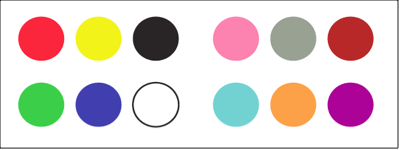
Work done by Colin Ware (building off the work done by Kay and others) and his own work on perception, has produced maximum set of 12 colors that can be accurately differentiated by people with standard vision without errors. These colors (shown below) are: 1. Red, 2. Green, 3. Yellow, 4. Blue, 5. Black, 6. White, 7. Pink, 8. Cyan, 9. Gray,10. Orange, 11. Brown, 12. Purple.
These colors are the most easily identifiable colors based on perceptual research, and can be used to code data with a high degree of decoding accuracy in humans that do not experience color blindness. The 12 colors above were then taken by me as a starting point in which to extract a larger set of colors in order to assign one color for every letter in the alphabet.
Choosing the Colors
I started by removing the color white from the color set in order to be used as a background color (for printing on white paper) which left a set of 11 colors to work with.
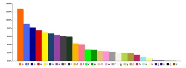
After analyzing the frequency graph for the letters as they occurred in English (Letter Frequency) I noticed a trend that the vowels all showed up at the upper half of the graph (with 4 of them making the top 5).
I decided to make them the most distinct, by mapping the most saturated primary/secondary colors in the following arrangement: A=blue, E=orange, I=yellow, O=red, and U=green.


(The patches used above list the RGB {red, green, blue} luminance channel values using an 8-bit/channel color space)
The next set of high frequency letters were mapped with the colors: T=cyan, S=purple, L=pink, and H=gray. I noticed that variations in the colors at this point with pink having two possible hues that of salmon and rose, the same for purple, gray and cyan.


The remaining letters were mapped with colors that differed in shade, hue and saturation to the above sets:


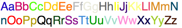
Below is a representation of the full color set used.
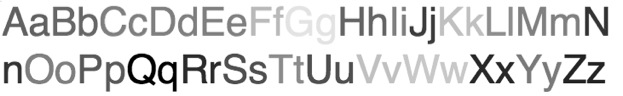
This a a representation of the set but based on just luminance value (a major decoding element used by people in conjunction with color).
These values will then be mapped to a set of pantone patches and the CIE for use in direct reflective printing to insure accuracy at the press. <http://en.wikipedia.org/wiki/List_of_colors>


RGB values are as stated for each character.
(letter ) (r,g,b)
(A *)(0, 0, 180) blue
(B *)(175, 13, 102) red-violet
(C *)(146,248,70) green-yellow
(d *)(255, 200, 47) yellow-orange
(e *)(255,118,0) orange
(f *)(185,185,185) light-gray
(g *)(235,235,222) off-white
(h *)(100,100,100) gray
(i *)(255,255,0) yellow
(j *)(55,19,112) dark-purple
(k *)(255,255,150) light-yellow
(l *)(202,62,94) dark-pink
(m *)(205,145,63) dark-orange
(n *)(12,75,100) teal
(o *)(255,0,0) red
(p *)(175,155,50) dark-yellow
(q *)(0,0,0) black
(r *)(37,70,25) dark-green
(s *)(121,33,135) purple
(t *)(83,140,208) light-blue
(u *)(0,154,37) green
(v *)(178,220,205) cyan
(w *)(255,152,213) pink
(x *)(0,0,74) dark blue
(y *)(175,200,74) olive-green
(z *)(63,25,12) red-brown
“If there were a theory of colour harmony, perhaps it would begin by dividing the colours into groups and forbidding certain mixtures or combinations and allowing others. And, as in harmony, its rules would be given no justification.”
-Ludwig Wittgenstein