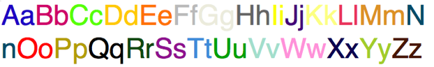
The Development of the Glyphs and Symbols Used to Hold the Color.

As the use of existing glyphs within the several font sets would not adequately allow readers to easily navigate through the color data I have developed my own set of fonts/glyphs to hold and present the color text. This set of fonts will allow the reader a easier time to read the specific letters that make up the words and sentences when a greater density of textural information is required.
The choice on the style of the shapes for the individual letters, width for the spacing between words (kerning), the size and shapes of punctuation as well as the inclusion of capital letters all needed to be taken into consideration.
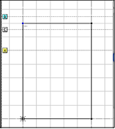
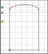
For the basic alphabetical character, I tested several simple rectangles of differing widths until I select a vertically oriented rectangle that provides enough visual information to quickly discriminate the color patch while taking up less horizontal real-estate. I differentiated a capital from a lowercase letter by adding a curve on the top of the letter (giving the letter a greater height but not interfering with the way the sentence flowed)
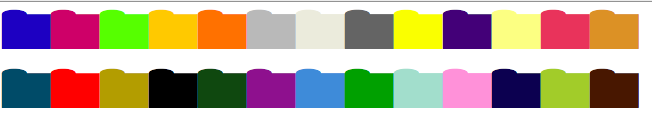
Some items (such as periods, question marks, and exclamation points used to denote the end of a sentence needed to be reworked to better show when a sentence grouping has come to an end. I also modified many of the symbols that allowed readers to understand the cadence of the work (commas, semicolons, colons, etc) as well as symbols used to denote spoken text (such as quotes).
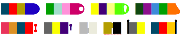 Top row shows example of a period, question mark, exclamation mark, and a comma. The second row show example of a colon, semi-colon, a dash, a apostrophe and finally a set of surrounding quotations.
A new addition (based on symmetry to the ending of the sentence) to the punctuation I developed, was the removal of capital letter from the beginning of sentences and use of an “inverted period” (semicircle) to denote the beginning of a new thought (sentence). This allows a quicker visual grouping to take place so that the reader can rapidly identify sentences within a block of text!
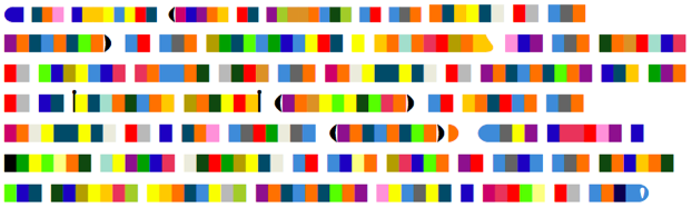
The same paragraph text (above) written in color with the color font system that has been developed.
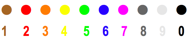
Finally, I also changed the shape of the digits 0-9 to make it clear when numbers are being used within a text. These digits will follow the standard for resistors color mapping (which overlap many of the letter colors).
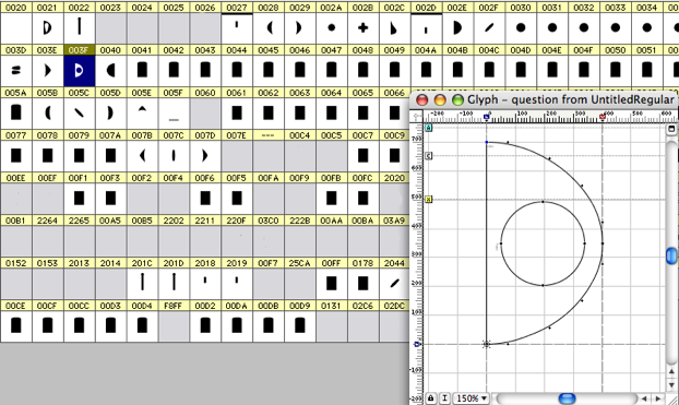
Example of the templates used to design the ASCII character font:
Convert a block of text into color at: